The Challenge
Bloom & Silk Spa required a complete brand identity system that embodied softness, elegance, and restorative luxury. The objective was to create a visual language that felt calm and premium, while remaining scalable across physical and digital touchpoints.
The brand needed to stand out in a saturated beauty and wellness market often defined by either overly clinical or overly decorative aesthetics.
Bloom & Silk required:
A refined yet emotionally warm identity
A consistent system adaptable across print, digital, and in-store applications
A visual presence that communicated trust, comfort, and discretion
The goal was not just to design a logo, but to build a cohesive brand architecture.
The Solution
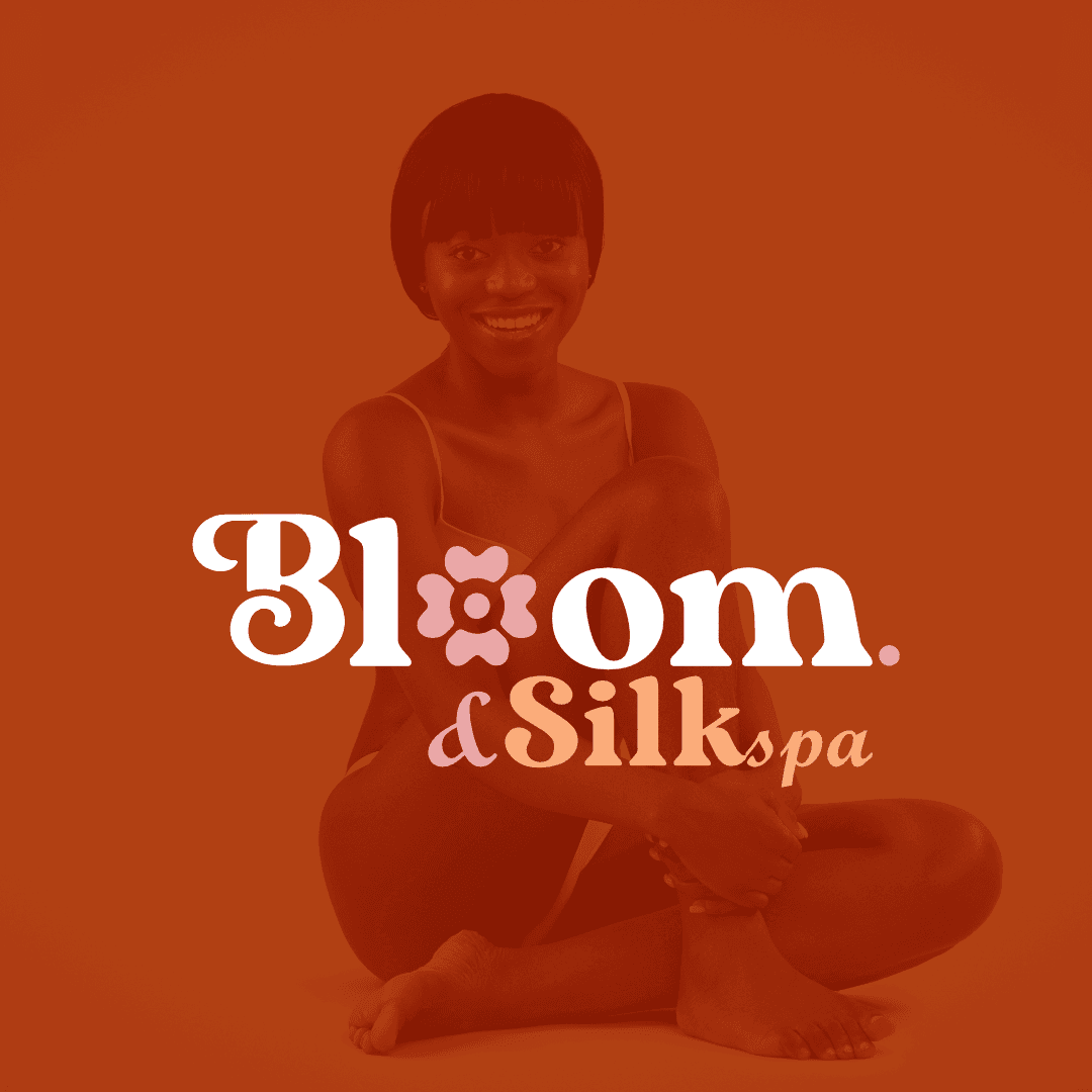
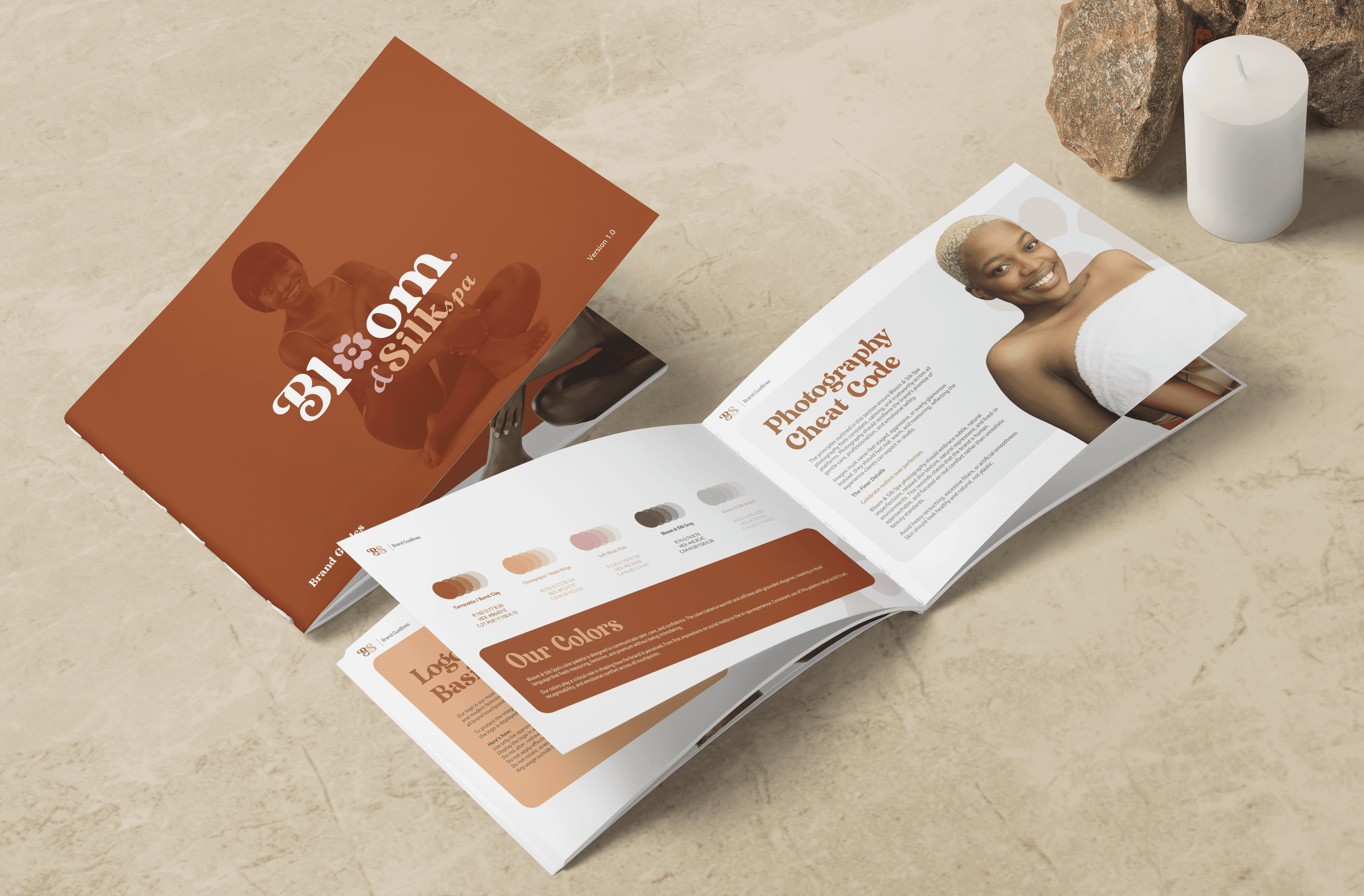
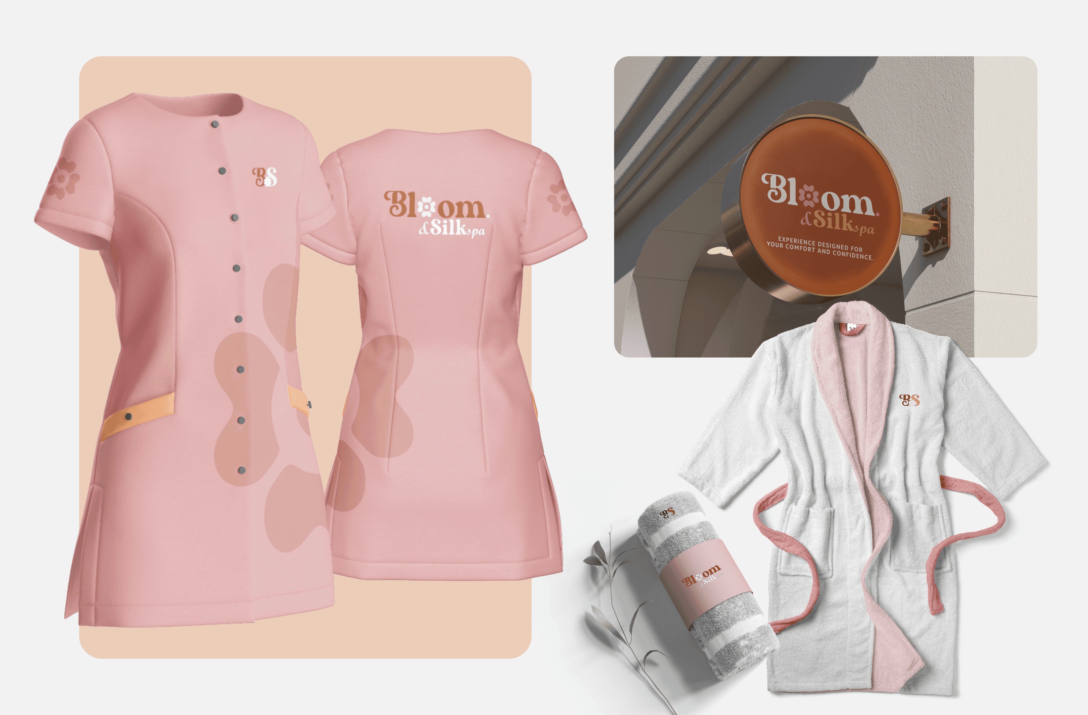
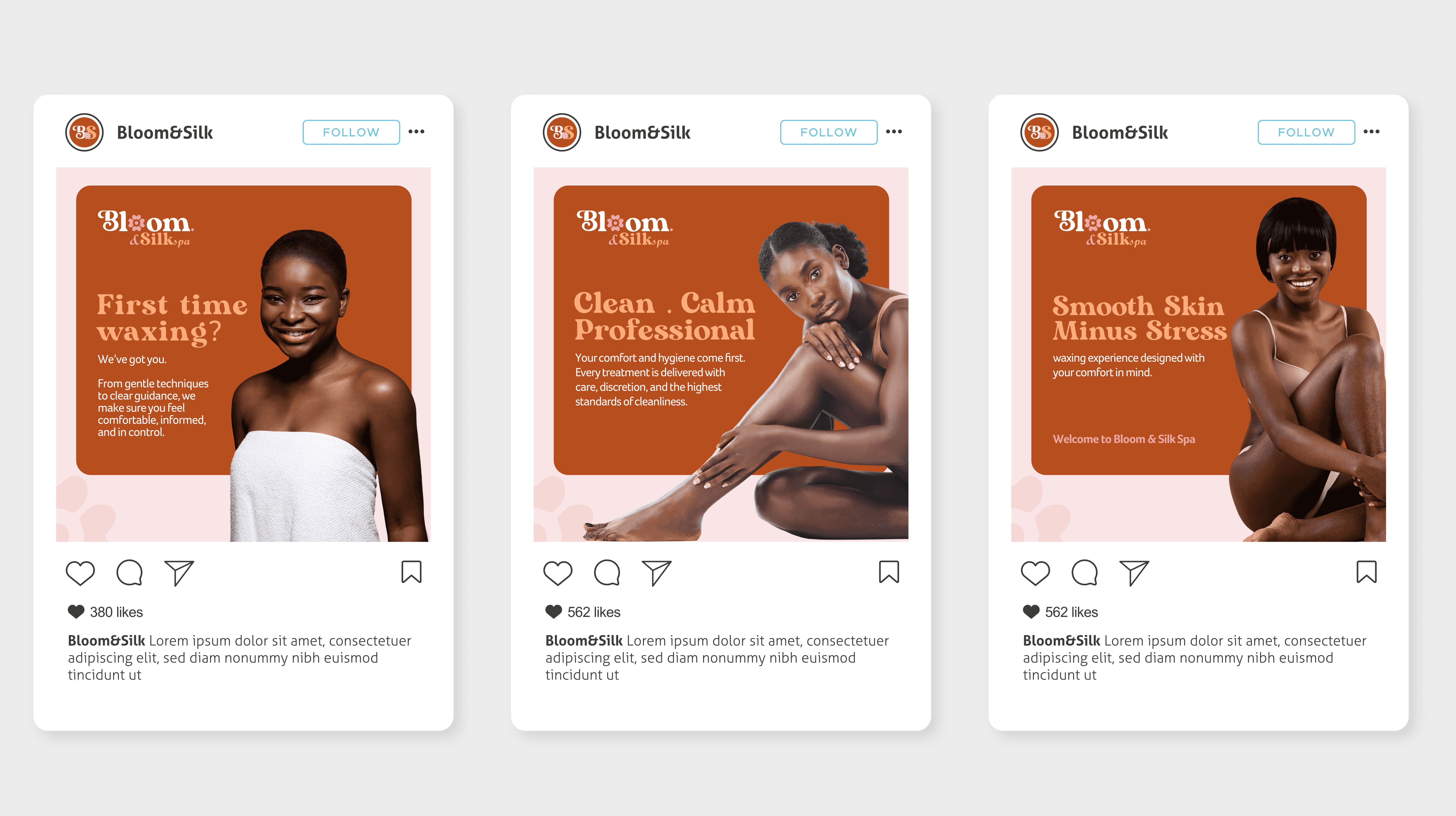
I developed a complete identity system grounded in restraint, clarity, and softness.
Brand Architecture
Elegant logo system with balanced typography
Warm blush-toned color palette supported by neutral foundations
Refined typographic pairing for sophistication and readability
Visual Language
Minimal, breathable layouts to evoke calm and space
Subtle graphic elements and patterns to reinforce brand personality
Carefully structured hierarchy to maintain consistency across applications
Application System
The identity was deployed across:
Business stationery
In-store collateral
Social media templates
Digital communication materials
Each asset was designed within a unified framework to ensure cohesion and long-term scalability.
Outcome
Bloom & Silk Spa now operates with a polished, consistent brand presence that reflects its promise of comfort, professionalism, and elevated care. The result is a visual system that feels calm, confident, and enduring, positioning the spa as a premium experience within its market.